It’s not very often that we are approached to rebrand a television classic like the long-running BBC 1 series Points of View. The production of this show had been relocated to Glasgow, and in conjunction, a rebrand was deemed necessary. As is often the case with broadcast work, time wasn’t a luxury we had; therefore, we had a very short two weeks to develop ideas, get one approved, and create a kit of parts for use throughout the show.
Throughout the process, we worked directly with the Series Producer, which was a significant help, as she was the decision-maker and quick to approve or reject ideas and content as we developed them. She also had a clear idea of what she wanted and provided a detailed brief. She knew what she didn’t like about the existing brand and what she envisioned for the new approach – ‘Refresh the colour palette, make the logo feel modern, vibrant, and relevant to the content of the show.’
We decided to start by developing the programme titles, as the rest of the content would be influenced by the chosen approach.
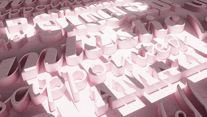
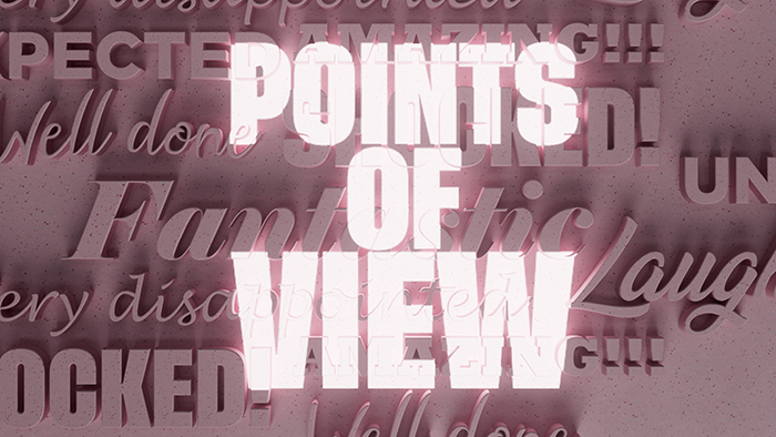
One of our ideas was to incorporate 3D text with a viewpoint light source. This approach combined words and perspective to reveal the title, which was created using a point light.


Next, we considered how best to introduce distinctive colours required for the rest of the GFXs and explored a slightly different approach.

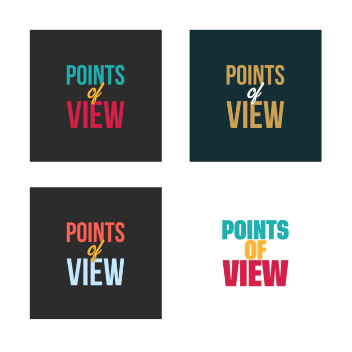
We were pleased with how the colours worked here. Viewers responded in either positive or negative ways, so it was important to represent these reactions. Additionally, there was a requirement for a more neutral complementary colour, hence the inclusion of yellow.
The client liked these colours but wanted to explore other options, possibly without the white. So, we provided some alternatives.

However, after seeing the white, she was happy to stick with it and the original vibrant colours.
At this stage, we also wanted to propose another approach for animating the text now that the logo itself was approved.
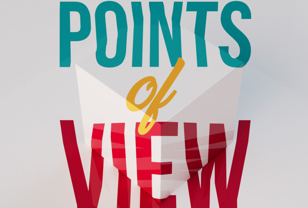
Simplifying the perspective idea, we placed the title on a 3D cube. The camera moves along the surface in several close-up cuts where only parts of the text can be seen. Then, the camera pulls back, revealing the title from one perspective where it resolves and becomes legible from our point of view.
Fortunately, the client instantly loved it and signed it off. This allowed us to create the rest of the in-programmed graphics based on the cube motif and the same colour palette.
In the UK, Points of View can be watched on the BBC iPlayer.
https://www.bbc.co.uk/iplayer/episode/m00177rg/points-of-view-2022-episode-3

